CSS Filter Generator
Apply CSS filters to any image visually. Blur, brightness, contrast, saturate, grayscale, sepia, hue-rotate, invert, opacity. Live preview, copy CSS.
filter: none;
tuneFilters
stylePresets
What is the CSS Filter Generator?
A CSS filter generator builds the filter declaration that applies visual effects to any element with the same syntax browsers use for image processing: blur, brightness, contrast, saturate, grayscale, sepia, hue-rotate, invert, opacity. The result works on images, video, divs, anything; the syntax is identical to what would run in a build pipeline.
How to use the CSS Filter Generator
- 1
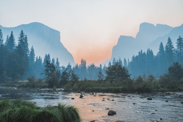
Pick or paste an image
The default sample is a landscape photo. Paste any public image URL into the input below the preview to test on your own content.
- 2
Adjust the nine filter sliders
Each slider has its default value (no effect) and a real range. The label highlights primary when the filter is active, with a small reset link to clear that one.
- 3
Try a preset
Ten quick looks: Vintage, B&W, Warm, Cool, Vivid, Faded, Dramatic, Blur, Inverted, None. Each one loads a tested combination of the basic filters.
- 4
Copy the CSS
The full filter: blur(2px) brightness(120%) ... declaration appears below the preview, ready to drop into a stylesheet.
Frequently Asked Questions
What CSS filters can I apply?
Nine: blur (px), brightness (%), contrast (%), saturate (%), grayscale (%), sepia (%), hue-rotate (deg), invert (%), opacity (%). Each maps to a CSS filter function and combines into one filter declaration. Drop-shadow isn't included; for shadows, use the box-shadow generator.
Can I combine multiple filters?
Yes, that's the default. Active filters concatenate into one declaration: filter: blur(2px) brightness(120%) contrast(110%);. Order matters in CSS filters (each runs on the output of the previous), but the generator outputs them in a stable order so the result is consistent.
Can I preview with my own image?
Yes. The Image URL field below the preview accepts any public HTTPS image URL. The browser loads it directly into the <img> tag, so the same CORS and SVG rules apply that any web page would face. If a URL fails, the preview falls back to the sample landscape.